In today’s digital-first world, having a beautiful website isn’t enough—it must be responsive. For Shopify store owners, this is especially true. With the majority of online traffic coming from mobile devices, the need for a bold and functional Responsive Shopify Store Design has never been more critical.
Whether you’re launching a new store or revamping an existing one, prioritizing Responsive Shopify Store Design can directly impact your sales, customer retention, and overall user experience. Let’s dive into what it is, why it matters, and how to create a winning design that adapts seamlessly to every screen size.
What is a Responsive Shopify Store Design?
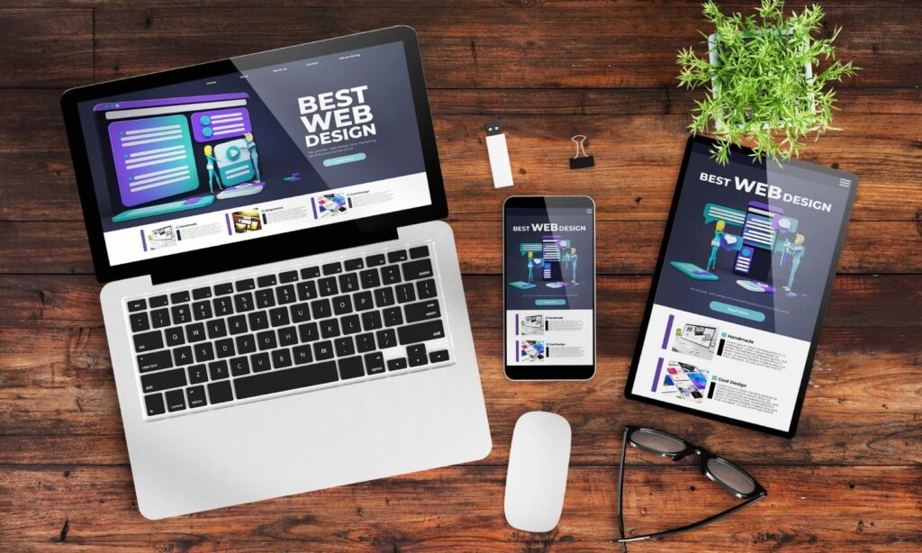
A Responsive Shopify Store Design automatically adjusts the layout and elements of your store based on the user’s device—desktop, tablet, or smartphone. Instead of creating different versions of your website for different devices, a responsive design ensures one unified experience that adapts fluidly.
Think of it as a “flexible” design approach that enhances usability, increases conversion rates, and provides a seamless brand experience across devices.
Why Responsive Design is Crucial for Shopify Stores
1. Mobile-First Traffic
Recent statistics show that over 70% of ecommerce traffic comes from mobile devices. If your store isn’t optimized for mobile, you’re potentially losing a significant chunk of your audience. A Responsive Shopify Store Design ensures your website looks and works great on any screen size, capturing the attention of on-the-go shoppers.
2. Higher Conversion Rates
A clean, easy-to-navigate layout that loads quickly and functions well across devices leads to fewer bounces and more purchases. Visitors are more likely to trust a store that looks professional and functions correctly, which ultimately increases conversions.
3. Improved SEO Performance
Search engines like Google prioritize mobile-friendly websites. A Responsive Shopify Store Design helps improve your rankings in search engine results, driving more organic traffic to your store.
4. Consistent Branding
A responsive design ensures that your brand’s visuals and messaging remain consistent across all platforms. This builds trust and reinforces brand identity, no matter where your customers are viewing your store.
Key Elements of a Responsive Shopify Store Design
1. Mobile-Optimized Themes
Start by choosing a mobile-optimized Shopify theme. Shopify offers numerous responsive themes in its theme store, both free and paid. Themes like Dawn, Prestige, Impulse, and Debut are known for their adaptability and user-friendly layouts.
When choosing a theme, consider:
- Load speed
- Customization options
- Reviews and support
- Mobile previews
A solid theme is the foundation of any effective Responsive Shopify Store Design.
2. Flexible Images and Media
Use scalable images that maintain quality across devices. Avoid fixed widths and opt for percentage-based sizing. Shopify’s built-in tools allow you to adjust image behavior for different screens, ensuring that photos load fast and look great on mobile and desktop.
3. Adaptive Navigation
Navigation menus should adjust based on the device. On desktop, a horizontal menu may work well, but on mobile, you need a collapsible (hamburger) menu for easy browsing. A good Responsive Shopify Store Design keeps navigation intuitive and clutter-free.
4. Responsive Typography
Fonts should be readable on small screens without needing to zoom. Use relative sizing (em, rem) instead of pixels, and choose clean, legible font styles. Ensure that headings, body text, and buttons are spaced appropriately to avoid accidental clicks.
5. Touch-Friendly Elements
Buttons, forms, and sliders must be optimized for touch screens. Ensure there’s enough spacing between clickable elements to prevent user frustration. Every component in your Responsive Shopify Store Design should cater to touch-based interactions.
6. Quick Loading Times
Responsiveness also means performance. A slow-loading website—even if beautifully designed—will lose customers fast. Compress images, minimize scripts, and use lazy-loading where appropriate. Shopify apps like PageSpeed Optimizer can help improve your store’s performance.
Tips for Designing a Responsive Shopify Store
✅ Start with Mobile-First Design
Designing for mobile first forces you to focus on essential features and keeps your layout clean. It also ensures your store is optimized for the most common device used by shoppers today.
✅ Test Frequently Across Devices
Use tools like Shopify’s theme editor, Chrome DevTools, and third-party services like BrowserStack or Responsinator to see how your site looks on different devices. Testing is key to delivering a truly Responsive Shopify Store Design.
✅ Use Apps and Tools Wisely
There are numerous apps in the Shopify App Store that enhance responsiveness:
- Shogun or PageFly for custom page layouts
- Judge.me for responsive reviews
- Instafeed for mobile-friendly Instagram integrations
Choose tools that play well with your theme and don’t bloat your site’s performance.
✅ Don’t Overcomplicate the Layout
Keep it simple. Too many elements can clutter your design and confuse users. Use whitespace effectively and let your products take center stage. A minimal and clean Responsive Shopify Store Design is often the most effective.
Common Mistakes to Avoid
- ❌ Using non-responsive third-party apps that break layout on mobile
- ❌ Not optimizing images, leading to long load times
- ❌ Ignoring tablet views—these users matter too!
- ❌ Over-relying on desktop design and assuming it will “work” for mobile
Avoid these pitfalls to ensure a polished, high-converting Shopify store.
Real-World Examples of Great Responsive Shopify Stores
- Allbirds – Sleek mobile layout, large touch-friendly buttons, and simple navigation.
- Gymshark – Product images resize beautifully and the mobile checkout process is frictionless.
- Hiut Denim Co. – Clean typography, responsive storytelling layout, and excellent speed.
Each of these brands has nailed their Responsive Shopify Store Design, offering consistent and delightful experiences across devices.
Final Thoughts
Your Shopify store is your digital storefront—and just like a physical shop, it needs to be inviting, accessible, and easy to navigate. A strong Responsive Shopify Store Design ensures that your business doesn’t miss out on the growing number of mobile shoppers and remains competitive in an increasingly visual, fast-moving ecommerce landscape.
Investing in responsiveness is no longer optional. It’s a necessity. Whether you’re building from scratch or fine-tuning your existing layout, every effort you put into responsive design pays off in better engagement, higher conversion rates, and a more professional brand image.
If you’re serious about growing your online business, make Responsive Shopify Store Design a top priority—it’s your shortcut to a store that sells on every screen.